5 Design Tips For Real Estate Logo
There are plenty of real estate brokerage firms in the world. In order to stand out of the crowd, you need to make yourself known. And this can happen only by building a trustworthy brand. To gain trust from your audience you need a logo design that grabs maximum attention. Here are five tips to design the most outstanding real estate logo.
Keep it simple
The very first tip as you design your real estate logo would be to keep it as simple as possible. This is an essential design rule that you should remember. Minimal and simple logos are the only classy logos these days. Complex logos that are made by using too many colors and design elements do not do justice to the brand. It is really hard for the target audience to understand the logo when it has so many design features clubbed together in one. Also, customers remember simple logos more than any other. Always prefer choosing not more than 2 to 4 colors for the logo. Apart from the color, there should be just one graphic feature and font in the logo.
Design in accordance with the medium
A brand logo is used everywhere. From social media to print media, stationery and more you will use the same logo everywhere to represent your brand. No logo exists in a vacuum. Therefore when you design a logo, make sure it fits all of these mediums well. Pre plan how it will turn out as you use it at different places and then finalize the design. Many times thin fonts are used in the logo which later become invisible when printed. In such cases where you do not want to compromise with the design but also want your logo to stand out, consider making more than one version. This way you can use smaller logos at some places and larger at others.
Use colors wisely
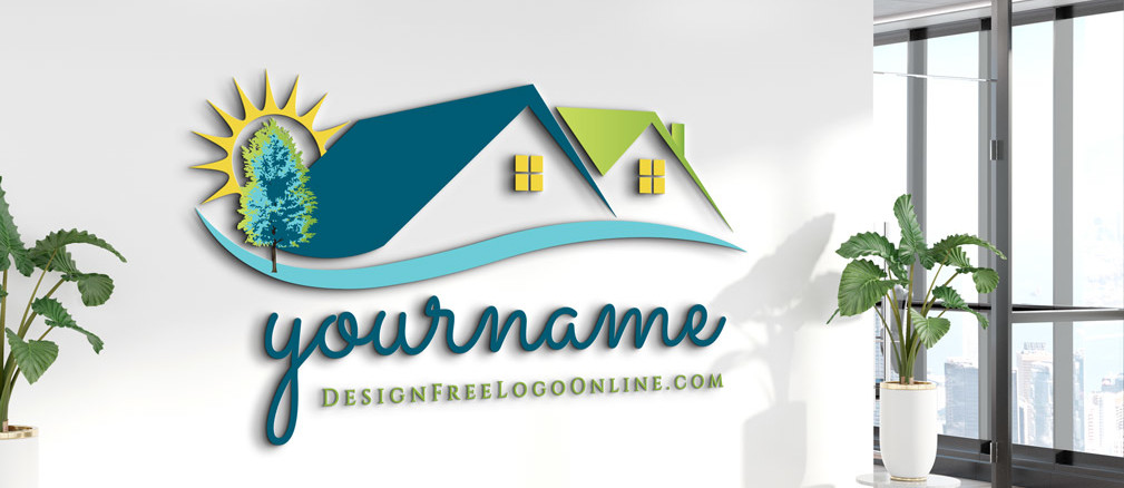
As mentioned above, be specific about your color palette. The fact that you are making a real estate company logo clarifies why you need clean and simple design. Color is one such factor that makes the brand logo more recognizable. You need to be wise about the choice of your color and combination. While choosing colors, find out what colors would do justice to your brand, services and products. Ask yourself if the chosen color will represent your brand right. For example colors like blue communicate loyalty and trustworthiness, green indicate new beginnings and wealth etc.
Choose font carefully
Other than colors, it is the font of the logo that grabs most attention. And not just attention but act as a medium to convey the initials of your brand. No matter how good a color combination you use for the logo, if it wont associate with the brand then everything will go into vain. Hence for this particular reason make sure that your company’s name in the logo is as clear as possible. It should be neat and clean.
Don’t be too generic
While a logo design should always fall on the side of simplicity, you still need to create a balance and not make it too minimalistic. Add enough unique features to the logo that represent your brand appropriately. You can also get inspiration from various real estate logo ideas available on the logo maker website online. In fact you can consider creating your logo from such websites too. Many websites help you create your own logo free of cost. When you design your own logo you will come up with the best output as no one but only you know all about your brand.
Design the perfect real estate logo on your own today!


